Heaton Research

Quick R Tutorial: The Big-O Chart

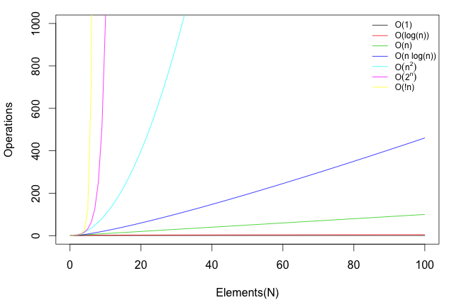
I needed an original Big-O chart for a publication. This tutorial does not cover what
Big-O actually is, just how to chart it. If you want more information on Big-O I
recommend reading this and this. I know, go figure, for a computer science student. I
really like using R for all things chart and visualization. So, I turned to R for this
task. While this is a very simple chart, it does demonstrate several very common
tasks in R:

  • Overlaying several plots
  • Adding a legend to a plot
  • Using “math symbols” inside of the text on a chart
  • Stripping off all the extra whitespace that R likes to generate

You can see the end-result here:

Computer Science Big-O Chart in R

This was produced with the following R code:

1
2
3
4
5
6
7
8
9
10
11
12
13
14
15
16
17
18
19
20
21
22
23
24
# Remove white space on chart
par(mar=c(4,4,1,1)+0.1)

# The x & y limits for the plot
xl <- c(0,100)
yl <- c(0,1000)

# Just use R's standard list of colors for the lines (I am too tired to be creative this morning)
pal <- palette()

# Plot each of the equations that we are interested in. Note the add=TRUE
# it causes them to overlay each other.
plot(function(n) (rep(1,length(n))),xlim=xl,ylim=yl,col=pal[1],xlab="Elements(N)",ylab="Operations")
plot(function(n) (log(n)),xlim=xl,ylim=yl,col=pal[2],add=TRUE)
plot(function(n) (n),xlim=xl,ylim=yl,col=pal[3],add=TRUE)
plot(function(n) (n*log(n)),xlim=xl,ylim=yl,col=pal[4],add=TRUE)
plot(function(n) (n^2),xlim=xl,ylim=yl,col=pal[5],add=TRUE)
plot(function(n) (2^n),xlim=xl,ylim=yl,col=pal[6],add=TRUE)
plot(function(n) (factorial(n)),xlim=xl,ylim=yl,col=pal[7],add=TRUE)

# Generate the legend, note the use of expression to handle n to the power of 2.
legend('topright', c("O(1)","O(log(n))","O(n)","O(n log(n))",
expression(O(n^2)),expression(O(2^n),"O(!n)"))
,lty=1, col=pal, bty='n', cex=.75)